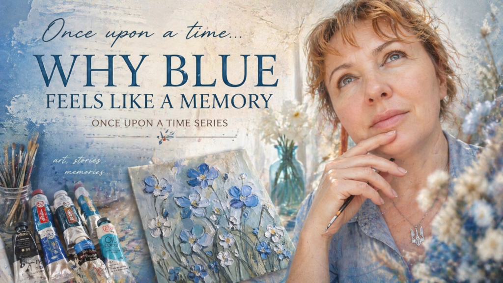
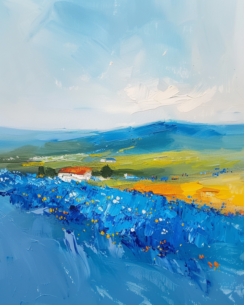
What Makes Blue Different from Other Colors
✨ IntroThere are colors we simply see…and there are colors we feel.Blue belongs to the second kind.It doesn’t demand attention.It doesn’t shout.And yet — it stays.In art, blue often feels like distance, silence, and something strangely familiar —like a memory we can’t fully recall.
This is something I started noticing in my own paintings —especially when working with blue tones.
I began to notice this in my own work —how blue kept returning, almost on its own.
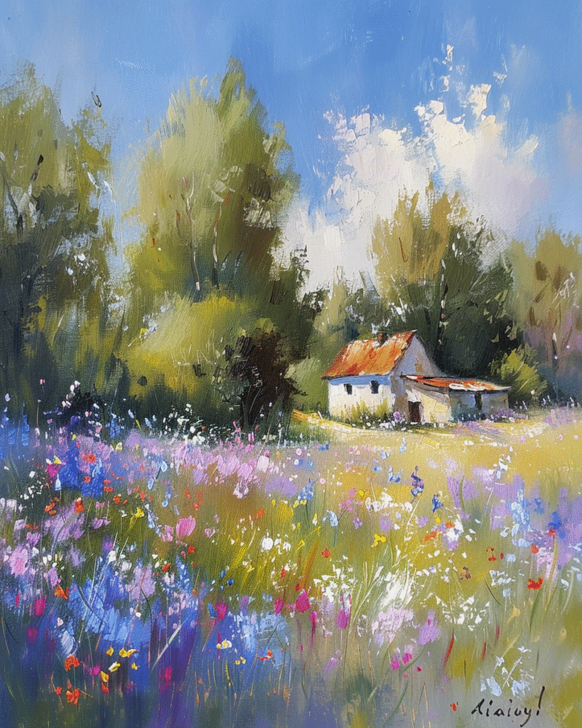
A Short History of Blue in Art
From Ultramarine to Emotional Expression
Blue in the Works of Great Artists
For centuries, blue has held a special place in painting. In the Renaissance, it was one of the most expensive pigments — ultramarine, made from lapis lazuli, was reserved for the most important elements, often the robes of sacred figures. Later, artists began exploring blue more freely:
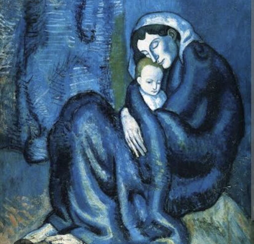
-Pablo Picasso used it to express melancholy and introspection during his Blue Period
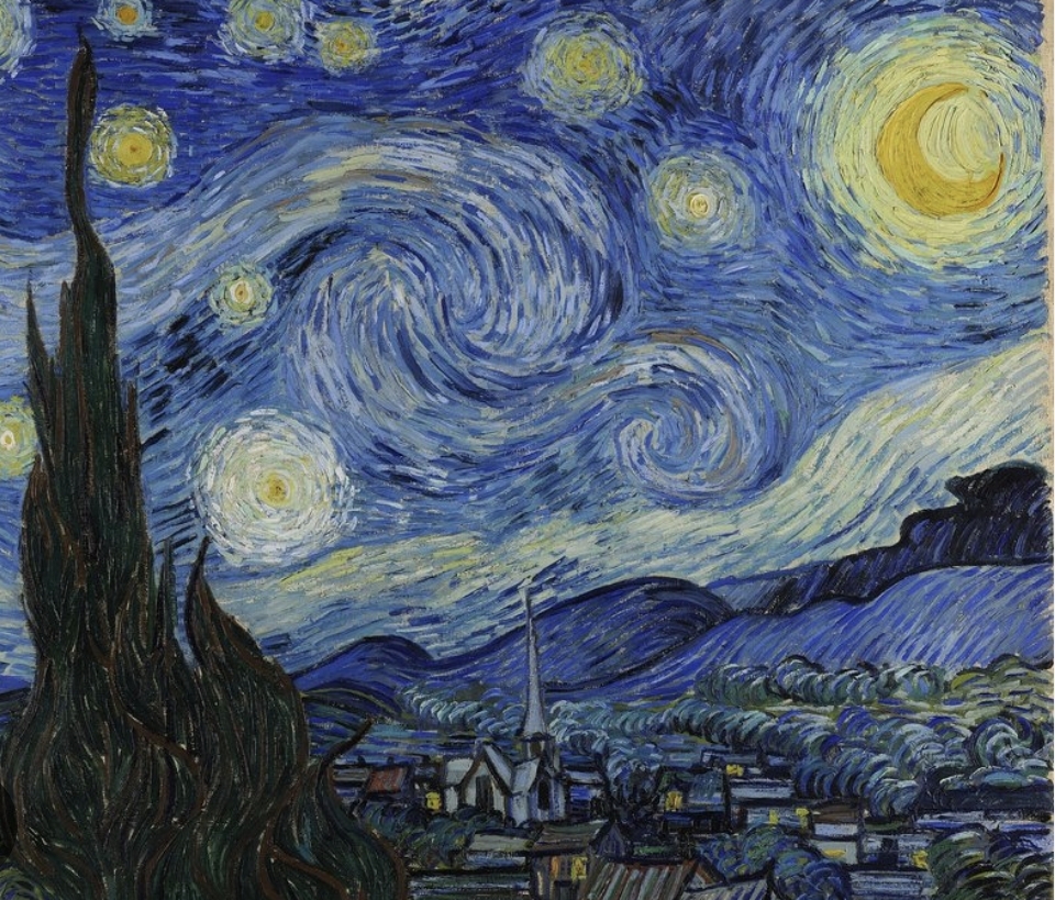
-Vincent van Gogh used blue to convey emotion, movement, and depth — especially in skies and night scenes
-Claude Monet explored blue light and atmosphere in landscapes and water reflections
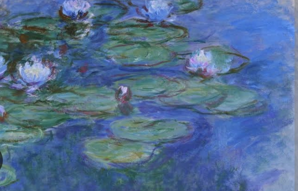
Blue was no longer just a color — it became a language of feeling.
💙 Why Blue Feels So Calm (and Why People Choose It)
There is a reason blue paintings are so often chosen for interiors.
Blue creates:
-a sense of calm
-visual space
-emotional distance
It doesn’t overwhelm the viewer — it invites them in.
Psychologically, blue is associated with:
-safety
-stillness
-reflection
In a world that often feels too fast, blue offers a pause.
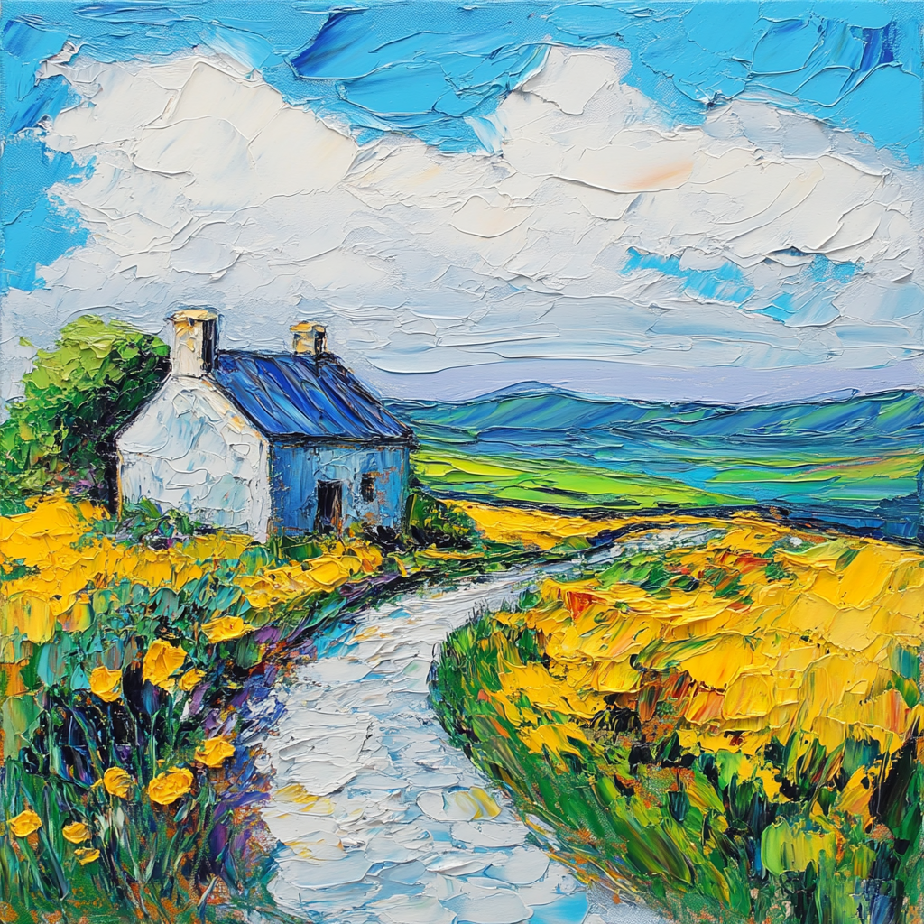
🏡 Blue in Interior Design
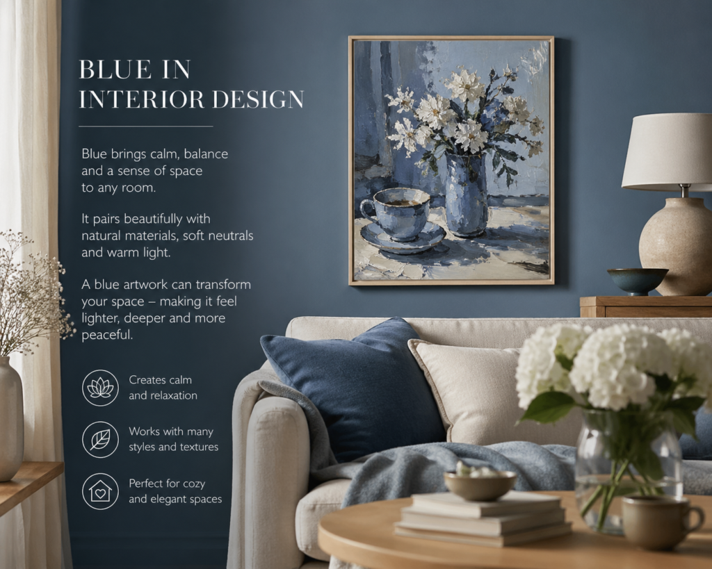
In interior spaces, blue works almost effortlessly.
It pairs beautifully with:
-white and linen textures
-natural wood
-soft neutrals
A small blue painting can transform a room:
- making it feel lighter
- more open
- more peaceful
This is why blue artworks are often chosen for:
- kitchens
- bedrooms
- quiet corners
- creative studios
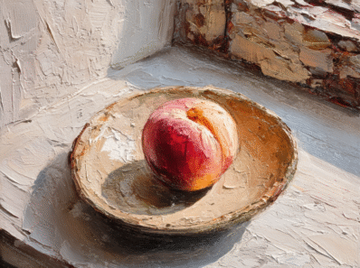
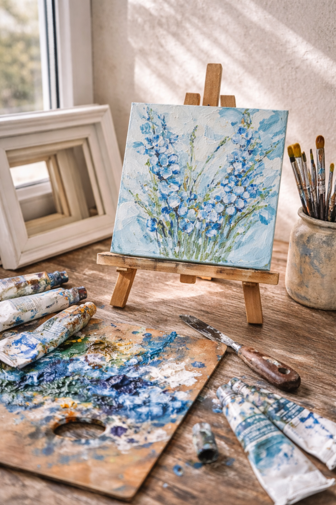
🎨 Materials: Working with Blue Paint
In my own practice, I work with different oil paint brands — each one brings a slightly different character to blue.
Some are softer and easier to mix, like Mona Liza, or VincenT — perfect for base layers and subtle transitions.
Others, like Winton or Winsor & Newton, Ukrainian Rosa, offer stronger pigment and deeper tones.
And paints like Van Gogh (Royal Talens) bring a balance — clean color, reliable mixing, and a sense of control.
But over time, I realized something important:
A beautiful painting doesn’t depend on the price of the paint —it depends on how you bring the colors together.
✨ From Color to Feeling
At some point, I stopped thinking about painting objects.
And started thinking about painting feelings.
Blue became more than a color —it became a starting point.
A mood.
A silence.
A memory.
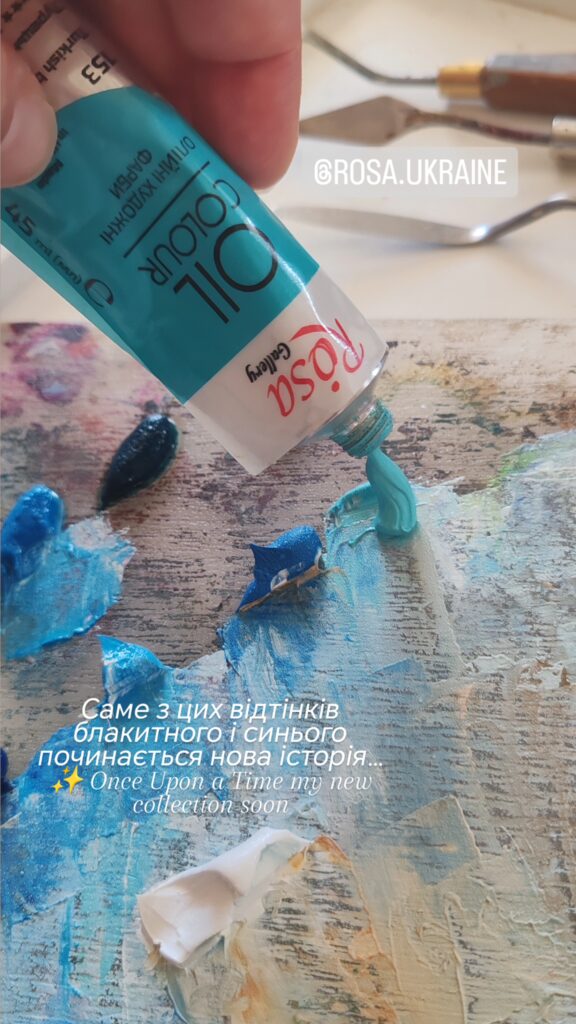
🌙 Once Upon a Time — A New Series
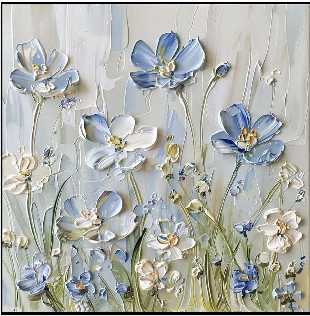
This is how my new series began.
✨ Once Upon a Time
A collection of paintings that are not about objects,
but about moments.
Moments that feel familiar…
but never truly existed.
Like déjà vu.
Like a dream you almost remember.
Each piece in this series is intuitive and unique —
a small fragment of something unspoken.
💫 Why Series Matter (for Artists and Viewers)
A single painting is a moment.
A series is a story.When artworks are connected, they begin to speak to each other —and the viewer becomes part of that dialogue.
For artists, working in series creates direction.
For viewers, it creates meaning.
🌿 Final Thought
Blue doesn’t just decorate a space.
It transforms it.
It brings calm.
It creates depth.
It holds something quiet and personal.
And maybe that’s why we return to it again and again.
Because sometimes…
we’re not looking for a picture.
We’re looking for a feeling.
If you feel drawn to this mood,you can explore my Once Upon a Time series here: https://ualinart.etsy.com